So that didn't go quite according to plan.
I suppose I have only myself to blame. I originally had in mind a street art project. Kind of a dipping-my-toes-in-the-water street art project. There is a lot of great architecture in DC, but some of the most interesting building in the city had been demolished years ago to make way for large sterile office buildings. On this part of 9th St. there used to be an amazing strip of buildings, including restaurants, movie theaters, and a burlesque house. I had in mind to make a piece honoring those lost buildings.
While there are lots of street artists I could name for inspiration, the main concept for this piece came from Delta Inc. who had made a wheat-paste street art piece that degraded over time in a semi-controlled way, revealing and becoming a new work in the process.
So I created two layers to my piece. The bottom being an image of what used to be, the top being what is now. The top layer had several purposeful cuts made in it, so that as it weathered, it would fall apart in a way to reveal the bottom layer. It being sort of a reversal of what actually happened, this time the office building is destroyed, returning the strip to the beautiful lost architecture that once was there.
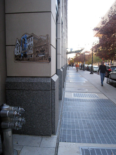
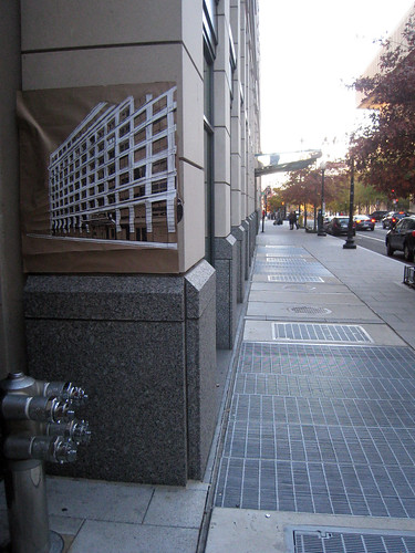
Alas, when I returned to the location a week after putting it up I saw that the piece had been completely removed. Which I should have expected, as that part of Chinatown is kept pretty neat and tidy. I doubt it made it past the Monday after I put it up before it was removed.

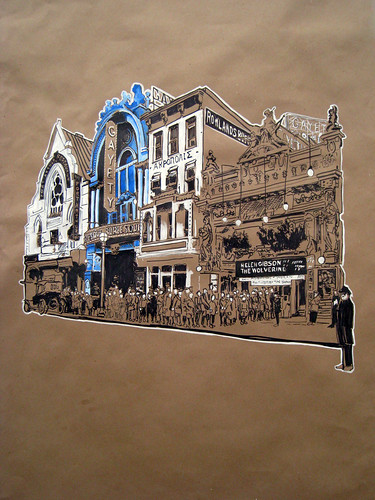
I'll have to be more clever about this next time...


I'll have to be more clever about this next time...

2 comments:
You concept is something people enjoy, especially in a neighborhood where every day things look the same.
Location looks like it could use that sort of life added to it but the pros are down there cleaning all day. Maybe you need to write a grant proposal to the DC Arts Commission and get them to support these kinds of installations with permission from the owners. Or go looking for a less manicured location.
Good try, great documentation and as always excellent drawings.
agree with Frederick. Your action probably surprised the few lucky ones that got to see it and puzzle about it and I'm sure it has ended in someone´s place and not in a bin.
Post a Comment